* * *
What have you learned from your audience feedback?
When I had received all the feedback that I needed and had analyzed it all thoroughly, I had come to the conclusion that there were certain things that I should have considered in the filming process. One thing that came up more than once was the story line, considering that I wanted to make a video that spoke for itself, people thought that it was difficult to follow the basic story line as much as I'd hoped.
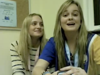
The Audience feedback is very important as part of my research and so it was difficult to ask the public an intricate question that included media terms and detailed answers when most of the time, the person wouldn't understand what I was asking. I learnt that to get a more specific answer, you need to ask specific questions, but to the more detailed answers, you would need to ask either media students or members of the public that have a deeper meaning for the media world. The Temper Trap had originally become popular in their home country, Australia, and so I thought that it would ideal to have two 'Natives' give feedback for a band that they know and love. The two girls below are very strong followers of The Temper Trap and I was thankful that they were so close by when I needed them;
 I also wanted to get a different country and begin to see how they found this certain music genre and the music video. This would give me the opportunity to see whether my video had made an impact on areas that weren't covered in the target audience. Two German students volunteered to answer some simple questions and I was please to find out that I had reached them. This meant that I had automatically enlarged my target audience and given the band more popularity than they had originally.
 I also wanted to get a different country and begin to see how they found this certain music genre and the music video. This would give me the opportunity to see whether my video had made an impact on areas that weren't covered in the target audience. Two German students volunteered to answer some simple questions and I was please to find out that I had reached them. This meant that I had automatically enlarged my target audience and given the band more popularity than they had originally.
The advantage of living in a boarding house filled with a wide variety of nationalities was the fact that I could receive a lot more audience feedback. I also wanted audience feedback from all ages and so as you see from my video, I have included ages such 12-35 giving me another advantage of variety.
* * *
How effective is the combination of your main product and ancillary texts?
The combination of my main product and ancillary texts are effective and successful in the term of originality and popularity. One of the main reasons why my combination is so effective is because of the genre I have chosen. Indie music is very open to new ideas and new styles. Indie music (also known as Independent Music) is very experimental and alot of different styles of music are named as Indie and the reason for this is because their music style or the emphasis on their lyrics gives them an individuality that is so different to any other genre let alone the Indie genre they are currently in. One of my main aims was to give the Temper Trap an individual Indie style that would stand out, I felt that the music video that they currently have for "Sweet Disposition" wasn't very challenging and didn't give the band a chance to show off what they can do but at the same time show the public that they are individual and easy going.
I wanted the main product and the ancillary texts to be extremely different and so the music
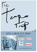
 video became a very natural and very narrative. The digipack and the magazine ad were intended to be very different and so the designs for them were either very busy and extreme or very basic. This gave the band a very approachable personality and, in my opinion, has helped to widen their target audience and increase their popularity. The ancillary tasks were created with Photoshop CS4 and so the use of this high tech program gave me the opportunity to create something as high quality as any other ancillary texts that we see in magazines and album covers everywhere. My main product was something that i wanted to stand out compared to the ancillary texts but also have a relation to it also, and so the use of natural settings for the digipak design became the link between the main task and the ancillary tasks.
 The natural setting gave the band a more down-to-earth image that also gave them the opportunity to liven up the image by creating other music videos that would be more extreme compared to my music video. This would also attract the public's eye as they begin to see different sides the band has to offer. My music video becomes the 'root' of the beginning of their future successes.
* * *
How did you use media technologies in the constructions and research, planning and evaluation stages?


